Decathlon Checkout
Defining a scalable checkout vision to align Product, Design and Engineering around what to build next.
Overview
Challenge
Following a major rebrand, Decathlon’s checkout vision combined fundamental customer needs with longer-term ideas, making it difficult for teams to understand what was essential, what could wait, and ultimately what they should build towards.
Approach
I worked across Product, Design, Engineering and Fulfilment to create a clearer global checkout vision, grounded in customer pain points, UX best practice and technical realities. The work focused on simplifying the underlying journey and defining the capabilities needed to scale across markets.
Outcome
The vision helped shape future roadmaps across guest checkout, address lookup, clearer delivery choices, saved payment methods and integrated membership. The first part to reach experimentation, clearer delivery options, produced a successful A/B test with a projected multi-million-euro annual commercial impact.
Impact
€8.7m
Projected annual commercial impact of clearer delivery options (A/B test)

Process
Simplify the journey first
Before designing anything, I mapped the current and proposed journeys for guests and members to identify where we could remove unnecessary steps.
A simple principle emergedDon’t ask customers for information we already know.
For guests, this meant removing account creation from the critical path.
For recognised customers, it meant using known information and previous choices to progressively reduce effort.
Make checkout increasingly invisible
The vision became less about redesigning checkout and more about reducing how much customers needed to think about it.
- GuestAsk only what’s needed to purchase.
- Recognised customerUse what we already know.
- MemberUse saved addresses, fulfilment preferences and payment methods.
- Post-purchaseMake membership easy to join without blocking the transaction.
Recognise me when you can, make it easy when you can’t.
Turn the vision into capabilities
Rather than treating the concept as one large redesign, we broke it into capabilities that could independently improve the journey.
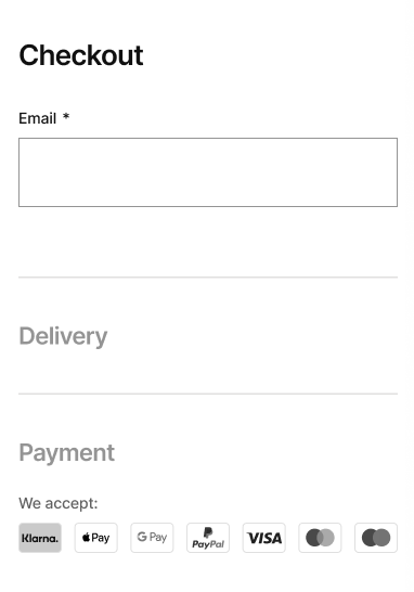
- Guest checkoutRemove unnecessary commitment
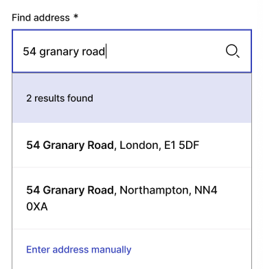
- Address lookup and autocompleteRemove unnecessary typing
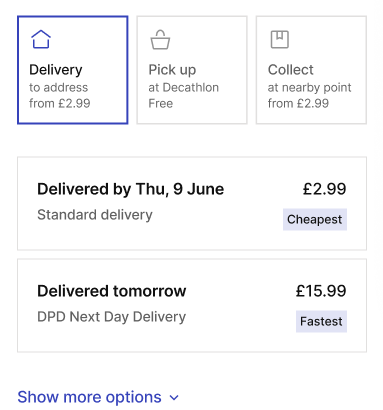
- Clearer delivery options, including fastest and cheapestRemove unnecessary decisions
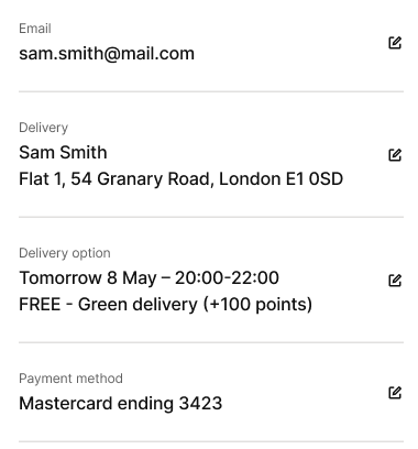
- Saved addresses, delivery preferences and payment methodsRemove unnecessary repetition
- Integrated sign-upMake membership additive
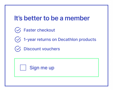


This gave Product and Engineering a clearer foundation for prioritisation and future roadmaps.
Make a global vision work locally
A simple customer experience crossed multiple areas of ownership internally.
I worked with Product, Engineering, Fulfilment and Design leadership to surface conflicting priorities, technical dependencies and market requirements.
The aim was to separate experience principles that should remain consistent globally from implementation decisions that needed flexibility locally.
From north star to roadmap
The vision wasn’t intended to ship as one large redesign.
It established a shared destination, then allowed individual capabilities to be prioritised, funded and tested independently.
- North starAn increasingly invisible checkout
- Capabilities
- Roadmap
- Test
- Learn
- Build
- Scale
Outcome
One of the first capabilities taken forward was clearer delivery choices.
The resulting A/B test successfully validated the direction, with a projected €8.7m annual commercial impact.
Other capabilities followed into testing:
- buyer rate · Guest checkout
- +2.88%
- sign-in rate · Email recognition note
- +23%
- Global vision established
- Core capabilities defined
- Future roadmap shaped
- First capability tested
The work gave the checkout organisation a common destination, and a practical way to start getting there.